Responsive Web Design
Building your sites to be usable on all modern and future web-enabled devices
 What is Responsive Web Design?
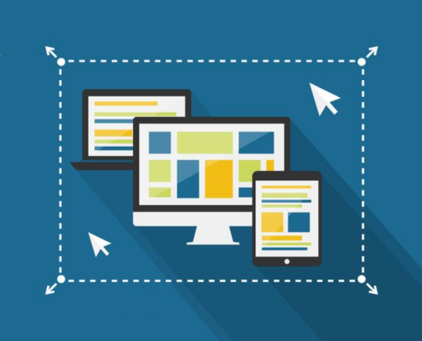
Responsive web design is a method of displaying websites on web devices (desktops, phones, tablets, TVs) so that all devices are served the same web pages and content via the same URL, and the display is adjusted to fit the web browser (or screen) viewport using CSS media queries.
Responsive web design originally made a splash in 2010 when Ethan Marcotte published his “Responsive Web Design” article on A List Apart.
Marcotte’s ideas have since become the virtual default standard for modern best-practice web design – ensuring website content is accessible to all users, regardless of where or how they browse the web.
Signify’s Responsive Web Design
Signify can work with you and your designers to make your website responsive, by:
- Taking a “mobile first” approach to your design. This will help with content prioritisation and mitigate page loading times on smaller devices.
- Working with you to make your content works with a mobile first design.
- Considering sign-off and approval for display on different devices (example.g. separate design templates for phone, tablet, and desktop).
Producing multiple design templates for different devices can be costly. Signify can work closely with web designers to:
- establish layout patterns for your site so it does not require separate design templates
- identify page objects that may contribute to a larger page load (e.g. graphics and JavaScript), and ways to mitigate page load times
- think about the different states of interactive elements, and how these may vary between devices (e.g. lack of hover-over ability on Android devices)
- think about navigation elements on pages, and how these may translate or differ between devices
We often use responsive frameworks such as Bootstrap and Foundation to demonstrate desired responsive functionality.
Once our approach to your responsive design is established and designs are approved, our developers will implement it using best practice development methods. Your website and content will be available to your users on the current crop and any future web-enabled devices.
Interested?
Talk to us to find out more about how we can help you understand your users and meet their needs.