First Credit Union
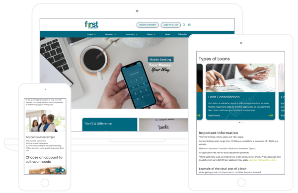
We designed and rebuilt a site to bring it up-to-date and make it easier to use.

The brief required a refresh of the site, to bring more imagery, reinforce the brand, as well as making it more accessible and dynamic.
First Credit Union also required an easier way to keep content up-to-date and incorporate videos for their members.
What we did
We designed the site to simplify the maintenance process, improve the navigation, create more movement while also making it clearer and easier to read.
The homepage in particular now does a lot more - showing potential members the benefits of joining, promoting services, and keeping the news items fresh.
We built content block types to embed google maps for branches, include YouTube videos and shorts, create carousels and accordions and display important notices, all while maintaining a consistent look and feel.
Technology
Silverstripe 4, with 3rd-party integrations.
"We’re thrilled with the wrap-around service that Signify offers.
|